Littlebrook is another small town from my D&D setting. The town itself hasn’t been relevant for the game as of yet, and it might never be so. However, it did give me the perfect opportunity to practice and learn. Specifically, I wanted to draw the map following this fantastic tutorial by Jonathan Roberts. The tutorial is written for Photoshop, but most of the aspects are easily translatable to GIMP.
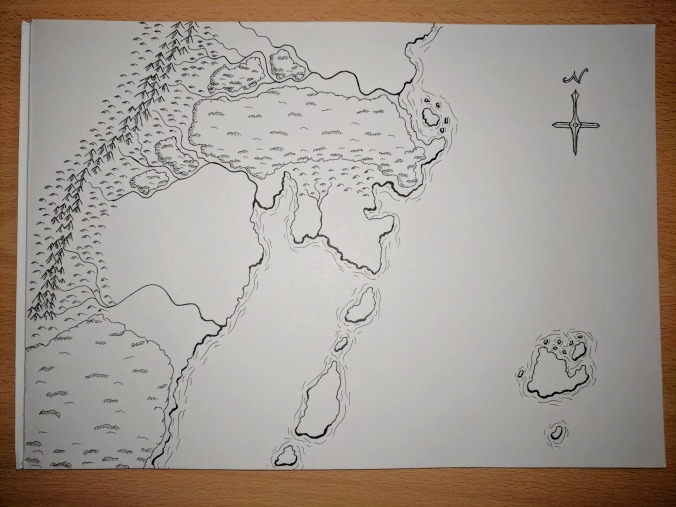
And here’s the final product:

As you can see Littlebrook lies within a very hilly region with the occasional little forest between the hills. I like the way the hills and the forests turned out. I am, however, not too happy about the river. I, probably, should have snaked it more between the hills, rather than keeping it this straight. While I am never completely happy with any of my maps, I do very much like the overall look and colours of this one. nice side benefit of this style is that it draws decent town maps relatively quickly, as it was far less time-consuming than my Stormcliff map.
Whereas my previous maps have all been initially drawn on paper, and then edited digitally, Littlebrook was drawn digitally from the get-go. The line work is still hand drawn though, as I made use of a Wacom Intuos tablet.
Following now are a few pictures of the first steps, as I would usually draw them on paper, but digitally this time. There’s hardly any difference.
The Sketch:

I know, my handwriting is horrible, but luckily that is not going to stay in the picture. Nothing is set in stone at this point, and can easily change in the next steps.
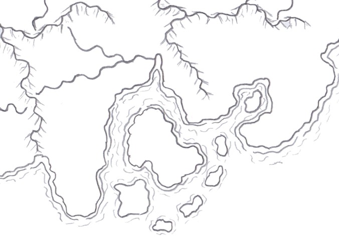
The Outlines:

After the sketch it is time to refine the outlines of the various shapes. You can see that some things moved around. There are more hills than on the initial sketch, and the tress are placed slightly differently. The town is already pretty much done at this point, as I wasn’t planning on adding any more detail than the simple black shapes. The roads have disappeared, but they will be added back in at a later stage.
The Details:

The detail lines will further enhance the outlines drawn previously, and give shape to everything. While previously all you had were random black lines, now the lines start to look like what they are supposed to look like. Usually I keep all the outlines I draw. In this case, however, I removed the outlines I had drawn for the hills and only relied on the detail lines. That is because the outlines I had drawn were too separated. Only using the detail lines makes it look like the hills are naturally flowing into each other.
This is usually the stage, at which point I would stop drawing on paper and scan the map to finish it digitally. When I draw on paper, I draw everything, including the detail lines by pencil first. Then I draw over the lines I want to keep with a black pen, and erase the pencil marks. There will always be a few marks and smudges left after erasing the pencil lines, but these can be edited out after scanning it in. In any way, both methods lead to very similar results, as you can see by comparing this to the scans from my previous posts.
I will definitely do more digital only drawings in the future. However, I don’t think I will completely switch to digital only, because it just does not feel the same as drawing on paper.